ggplot(data = csp_2020)4 Data visualisation with ggplot2
4.1 Data visualisation with ggplot2
Data visualisation is a powerful tool with multiple important uses. First, visualisations allow us to explore the data, identify potential outliers and errors, or check that the variables behave in the way we would expect them to if they had been recorded correctly. Visualisations can also be used as an analysis tool, allowing us to identify trends in the data or differences between groups. Finally, visualisations can help to convey messages to an audience in a clear, concise way that is often more powerful than presenting them using numbers or text. In some cases, data visualisations can show results so clearly that further analysis is arguably unnecessary.
4.1.1 Choosing the most appropriate visualisation
The most appropriate choice of visualisation will depend on the type of variable(s) we wish to display, the number of variables and the message we are trying to disseminate. Common plots used to display combinations of different types of data are given in following table:
R is very flexible when it comes to visualising data and contains a wide variety of options to customise graphs. This section will focus on the Tidyverse package ggplot2 and introduce some of the more commonly used graphical functions and parameters but is by no means comprehensive.
4.1.2 The ggplot2 package
The ggplot2 package implements the ‘grammar of graphics’, a system that aims to describe all statistical graphics in terms of their components or layers. All graphics can be broken down into the same components: the data, a coordinate system (or plot area) and some visual markings of the data. More complex plots may have additional layers but all must contain these three.
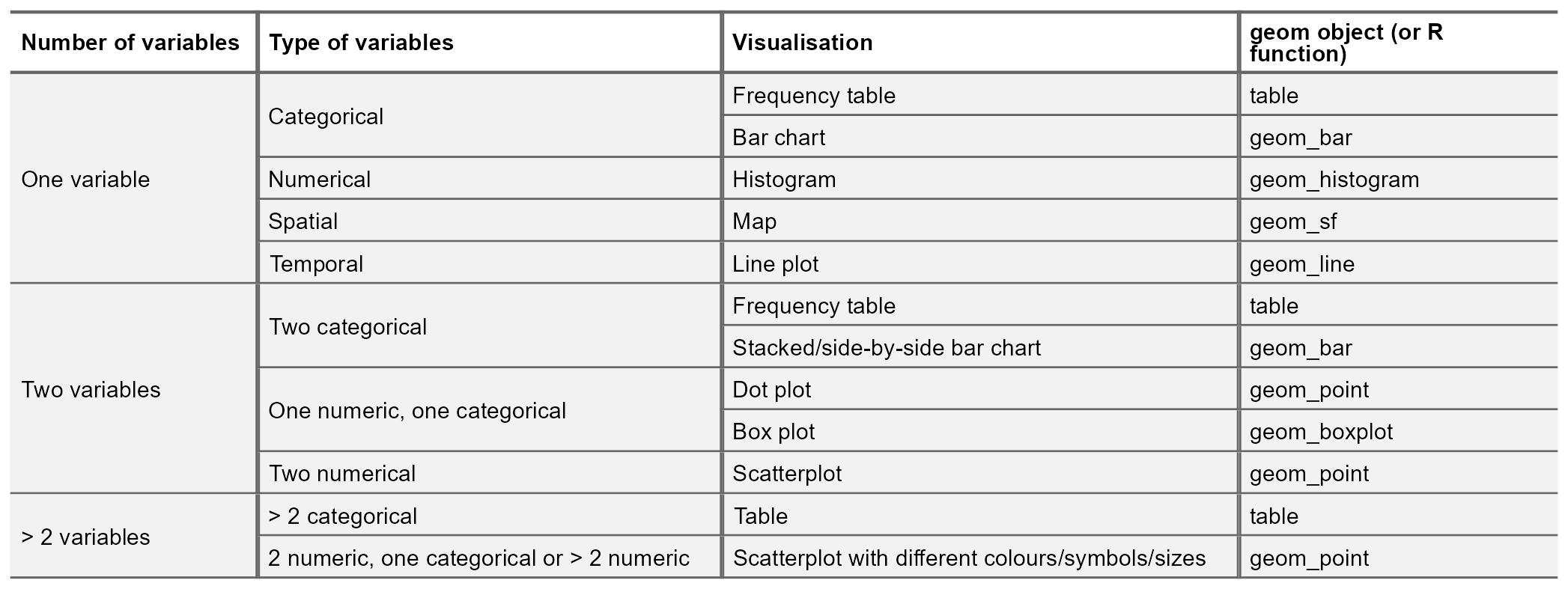
For example, in the csp_2020 dataset, we may wish to explore the relationship between the settlement funding assessment (sfa_2020) and council tax total (ct_total_2020) spending for each local authority. To visualise the relationship between two continuous numeric variables, a scatterplot would be most appropriate.
Within the ggplot2 package, we first use the ggplot function to create a coordinate system (a blank plot space) that we can add layers and objects to. Within this function, we specify the data that we wish to display on the coordinate system:
To add information to this graph, we add a geom layer: a visual representation of the data. There are many different geom objects built into the ggplot2 package (begin typing ?geom into the console to see a list). The geom_point function is used to create scatterplots.
Each geom object must contain a mapping argument, coupled with the aes function which defines how the variables in the dataset are visualised. In this case, we use the aes function to specify the variables on the x and y axes but it can also be used to set the colour, size or symbol based on variable values.
Warning
Although ggplot2 is a tidyverse package, it uses a different method of piping to the other packages. Use the + symbol to add an extra layer when working in ggplot.
# Generate the chart area and specify the data
ggplot(data = csp_2020) +
  # Add points, defined by sfa_2020 and ct_total_2020
  geom_point(mapping = aes(x = sfa_2020, y = ct_total_2020))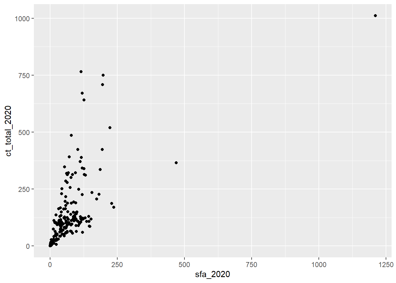
The resulting scatterplot shows a positive association between the SFA and council tax spending in English local authorities during 2020. We can identify an outlier in the top right corner of the graph. Before proceding, we want to ensure that this observation is an outlier and not an error to be removed from the data. We can use the filter function to return the name of the local authority that matches these values:
# Using the data csp_2020
csp_2020 %>%
  # Return just rows where sfa_2020 is over 1000, and then
  filter(sfa_2020 > 1000) %>%
  # Return the authority names
  select(authority)
## # A tibble: 1 × 1
##   authority
##   <chr>
## 1 Greater London Authority
This outlier is the Greater London Authority which is a combination of local authorities that are already included in the dataset. Including this observation would introduce duplicates into the analysis, and so this observation should be removed to avoid invalid results. To remove the Greater London Authority observation, we can combine the filter and ggplot functions using pipes:
# Take the csp_2020 data, and then
csp_2020 %>%
  # Return all rows where authority is not equal to Greater London Authority,
  # and then
  filter(authority != "Greater London Authority") %>%
  # Generate a plot
  ggplot( ) +
  # Add visual markings based on the data
  geom_point(aes(x = sfa_2020, y = ct_total_2020))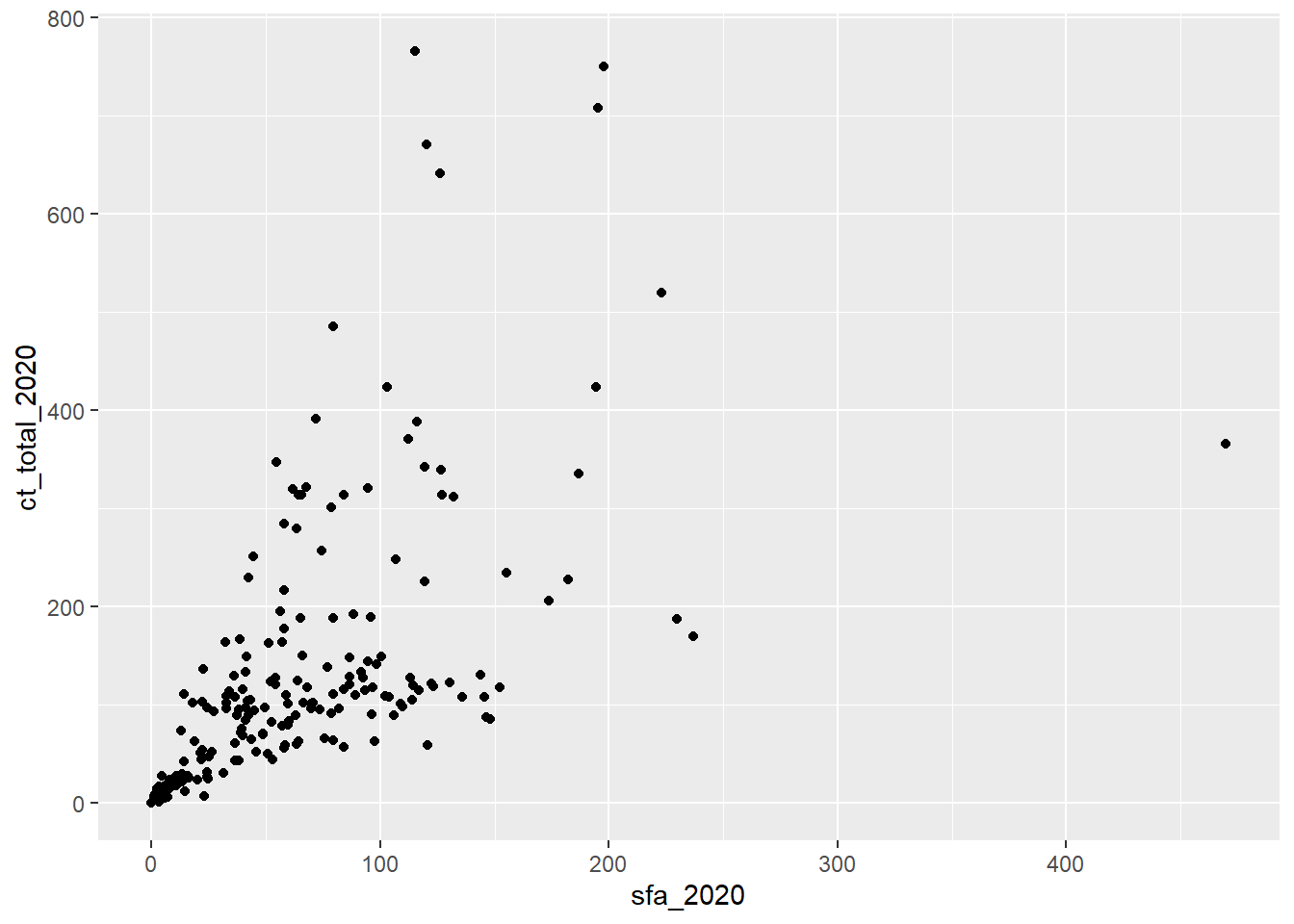
Graphs appear in the plot window in RStudio and can be opened in a new window using the  icon. Graphs in this window can also be copied and pasted into other documents using the
  icon and selecting Copy to clipboard.
New graphs will replace existing ones in this window but all graphs created in the current session of R can be explored using the ![]() icons.
icons.
Graphs can be stored as objects using the <- symbol. These objects can then be saved as picture or PDF files using the ggsave function:
# Create a new object, beginning from csp_2020, and then
sfa_ct_plot <- csp_2020 %>%
  # Return all rows where authority name is not GLA, and then
  filter(authority != "Greater London Authority") %>%
  # Create a ggplot area
  ggplot( ) +
  # Add visual markings from the data
  geom_point(aes(x = sfa_2020, y = ct_total_2020))

# Save the graph object as a png file
ggsave(sfa_ct_plot, filename = "sfa_ct_plot.png")
Exercise 5
- Create a new data object containing the 2020 CSP data without the Greater London Authority observation. Name this data frame
csp_nolon_2020. - Using the
csp_nolon_2020data, create a data visualisation to check the distribution (or shape) of the SFA variable. - Based on the visualisation above, create a summary table for the SFA variable containing the minimum and maximum, and appropriate measures of the centre/average and spread.
4.1.3 Customising visualisations
Additional variables can be included into a visualisation within the mapping argument of a geom function. For example, we could explore the relationship between SFA and council tax across regions by colouring points based on the region:
ggplot(data = csp_nolon_2020) +
  geom_point(aes(x = sfa_2020, y = ct_total_2020, colour = region))
By default, R uses alphabetical ordering for character variables. To change this order, the variable must be converted into a factor. A factor is how R recognises categorical variables. For example, to order the region legend so that the London region appears first, followed by other regions from north to south, we would use the mutate function, combined with the factor function to create a new, ordered variable. The argument levels allows us to specify the order of categories in a factor:
csp_nolon_2020_new <- csp_nolon_2020 %>%
  mutate(region_fct = factor(region,
                             levels = c("L", "NW", "NE", "YH", "WM",
                                        "EM", "EE", "SW", "SE")))

ggplot(data = csp_nolon_2020_new) +
  geom_point(aes(x = sfa_2020, y = ct_total_2020, colour = region_fct))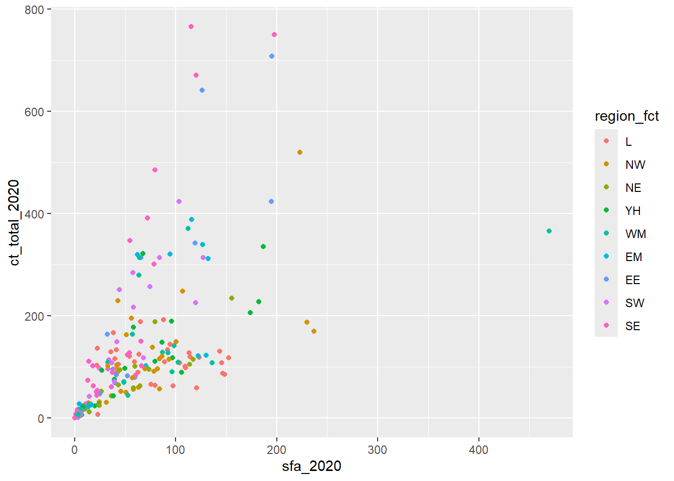
Arguments that can be adjusted within geoms include:
colour: change the colour (if point or line) or outline (if bar or histogram) of the markingssize: change the size of the markings (if point used)shape: change the shape of markings (for points)fill: Change the colour of bars in bar charts or histogramslinewidth: Change the line widthlinetype: Choose the type of line (e.g.dotted)alpha: Change the transparency of a visualisation
Warning
Although it may be tempting to add many variables to the same visualisation, be sure that you are not overcomplicating the graph and losing important messages. It is better to have multiple, clear but simpler visualisations, than fewer confusing ones.
Aesthetic properties of the geom object may also be set manually, outside of the aes function, using the same argument but with a shared value rather than a variable. For example:
ggplot(csp_nolon_2020_new) +
  geom_point(aes(x = sfa_2020, y = ct_total_2020),
             # Adding the colour outside of the aes wrapper as it is not
             # from the data
             colour = "blue")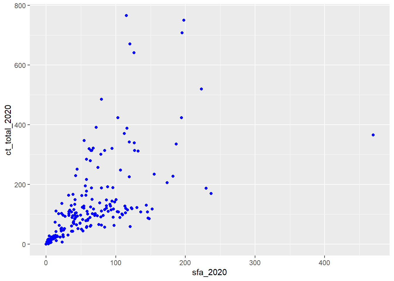
Exercise 6
- What is the problem with the following code? Fix the code to change the shape of all the points.
ggplot(csp_nolon_2020) +
  geom_point(aes(x = sfa_2020, y = ct_total_2020, shape = "*"))
Add a line of best fit to the scatterplot showing the relationship between SFA and council tax total (hint: use
?geom_smooth).Add a line of best fit for each region (hint: make each line a different colour).
4.1.4 Scale functions
4.1.4.1 Customising axes
Scale functions allow us to customise aesthetics defined in geom objects such as colours and axes labels. They take the form scale_'aesthetic to customise'_'scale of variable’. For example, scale_x_continuous customises the x axis when the variable is continuous, and scale_x_discrete can be used where the variable is discrete or categorical. Arguments to customise the x or y axes include:
name =to change the axis titlelimits = c(...)sets the axis limitsbreaks = c(...)defines tick markslabels = c(...)attaches labels to break valuestrans =transforms the scale that the axis is shown on.
ggplot(csp_nolon_2020_new) +
  # Scatterplot with SFA on x, CT on y, and colour by region
  geom_point(aes(x = sfa_2020, y = ct_total_2020, colour = region_fct)) +
  # Add title to x axis
  scale_x_continuous(name = "Settlement funding assessment (£ millions)",
                     # Set x axis limits from 0 to 600
                     limits = c(0, 600),
                     # Set tick marks ever 200
                     breaks = c(0, 200, 400, 600)) +
  # Add title to y axis
  scale_y_continuous(name = "Council tax (£ millions)",
                     # Show the y axis on a square root scale
                     trans = "sqrt")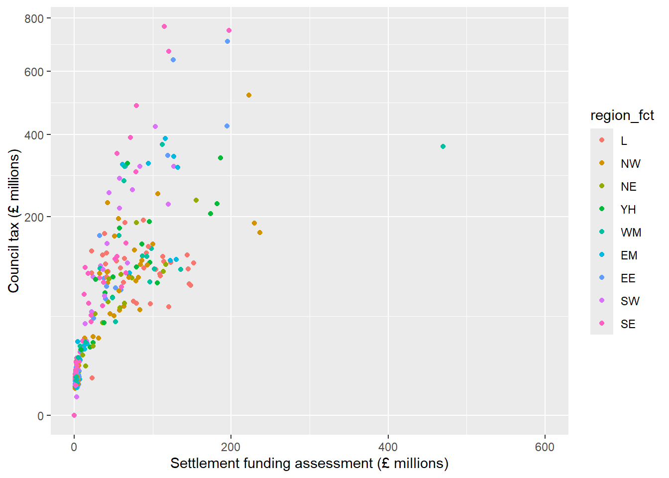
A common transformation that can be useful to explore the relationship between variables which have clusters of smaller values is the logarithm (or log) function. Applying a log function to a scale increases the difference between smaller values (stretching out these clusters), while reducing the difference between the smaller values and largest ones. Log functions can only be applied to positive, non-zero numbers. Where a sample may contain zeroes, the transformation log1p can be applied instead which adds 1 to each value before applying the log transformation (\(log(n + 1)\)):
ggplot(csp_nolon_2020_new) +
  geom_point(aes(x = sfa_2020, y = ct_total_2020, colour = region_fct)) +
  scale_x_continuous(name = "SFA", limits = c(0, 600),
                     breaks = c(0, 200, 400, 600),
                     trans = "log1p") +
  scale_y_continuous(name = "Council tax",
trans = "log1p") ![]()
We can now clearly see the strong positive association between SFA and council tax spending in local authorities with lower values of this without losing any information.
4.1.4.2 Customising colour scales
There are a wide range of options for customising the colour aesthetics of geoms. These include pre-defined colour palettes, such as scale_colour_viridis_c for continuous variables, or scale_colour_viridis_d for discrete or categorical variables. Viridis colour palettes are designed to be colourblind friendly and print well in grey scale. There are also many R packages containing colour palettes for different scenarios.
Colour palettes can be created manually for categorical variables using the scale_colour_manual function. Here, the argument values allows us to specify a colour per category.
Style tip
R contains a list of 657 pre-programmed colours that can be used to create palettes (run colours() in the console for a full list).
Hexadecimal codes can also be included instead in the form #rrggbb (where rr (red), gg (green), and bb (blue) are numbers between 00 and 99 giving the level of intensity of each colour).
Where a colour palette will be used across multiple plots, defining this list of colours as a vector and then entering this into scale_colour_manual will reduce repetition:
region_palette <- c("aquamarine2", "blue", "chartreuse2", "coral", "orchid",
                    "firebrick", "gold3", "violetred", "grey50")

ggplot(csp_nolon_2020_new) +
  geom_point(aes(x = sfa_2020, y = ct_total_2020, colour = region_fct)) +
  scale_x_continuous(name = "SFA",  trans = "log1p") +
  scale_y_continuous(name = "Council tax", trans = "log1p") +
  scale_colour_manual(name = "Region", values = region_palette)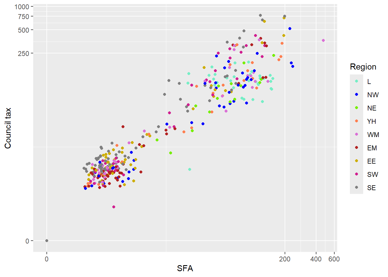
Palettes can also be created using gradients with the scale_colour_gradient function, that specifies a two colour gradient from low to high, scale_colour_gradient2 that creates a diverging gradient using low, medium, and high colours, and scale_colour_gradientn that creates an n-colour gradient.
4.1.5 Other labelling functions
Although axis and legend labels can be updated within scale functions, the labs function exist as an alternative. This function also allows us to add titles and subtitles to visualisations:
labs(x = “x-axis name”, y = “y-axis name”,
    colour = “Grouping variable name”, title = “Main title”,
    subtitle = “Subtitle”, caption = “Footnote”)
The annotate function allows us to add text and other objects to a ggplot object. For example:
annotate(“text”, x = 50, y = 200, label = “Text label here”)Adds “Text label here” to a plot at the coordinates (50, 200) on a graph, and
annotate(“rect”, xmin = 0, xmax = 10, ymin = 20, ymax = 50, alpha = 0.2)adds a rectangle to the graph.
4.1.6 Theme functions
The theme function modifies non-data components of the visualisation. For example, the legend position, label fonts, the graph background, and gridlines. There are many options that exist within the theme function (use ?theme to list them all).
Note
Many of the elements that can be customised within the theme function require an element wrapper. This wrapper is determined by the type of object we are customising (e.g. element_text when customising text, element_rect when customising a background, element_blank to remove something). Check ?theme for more information.
One of the most common theme options is legend.position which can be used to move the legend to the top or bottom of the graph space (legend.position = “top” or legend.position = “bottom”) or remove the legend completely (legend.position = “none”).
ggplot also contains a number of pre-defined ‘complete themes’ which change all non-data elements of the plot to a programmed default. For example theme_void removes all gridlines and axes, theme_light changes the graph background white and the gridlines and axes light grey:
ggplot(csp_nolon_2020_new) +
  geom_point(aes(x = sfa_2020, y = ct_total_2020, colour = region_fct)) +
  scale_x_continuous(name = "SFA",  trans = "log1p") +
  scale_y_continuous(name = "Council tax", trans = "log1p") +
  scale_colour_manual(name = "Region", values = region_palette) +
  theme_void( )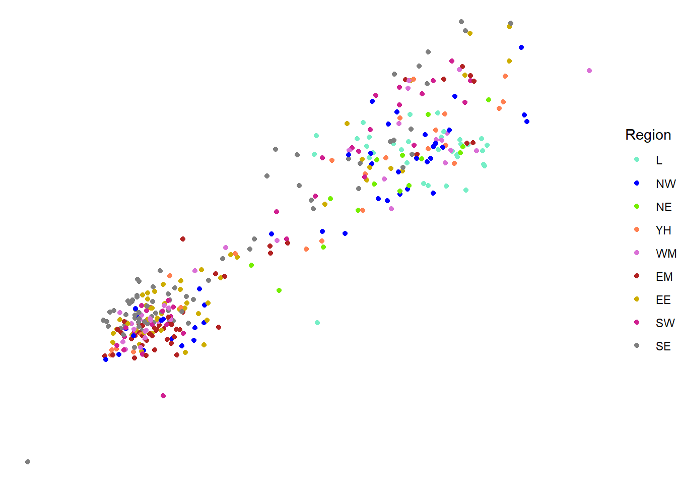
One benefit of using themes is that all visualisations will be consistent in terms of colour scheme, font size and gridlines. Although there are pre-built themes, we are able to create our own and save them as functions. These can then be used in place of R’s themes. For example:
# Create a theme function
theme_intro_course <- function( ) {
  # Move the legend to the bottom
  theme(legend.position =  "bottom",
        # Make the axis labels font size 10
        axis.text = element_text(size = 10),
        # Make the axis titles font size 15
        axis.title = element_text(size = 15),
        # Make the graph title font size 20
        title = element_text(size = 20),
        # Make the plot area white with a grey outline
        panel.background = element_rect(fill = "white", colour = "grey50"))
}
The function theme_intro_course can be added to the end of any visualisation and will move the legend to the bottom of the graph, change the axis text to size 10, the axis titles to size 15, the plot title to size 20, and the graph background to white with a grey outline:
ggplot(csp_nolon_2020_new) +
  geom_point(aes(x = sfa_2020, y = ct_total_2020, colour = region_fct)) +
  scale_x_continuous(name = "SFA",  trans = "log1p") +
  scale_y_continuous(name = "Council tax", trans = "log1p") +
  scale_colour_manual(name = "Region", values = region_palette) +
  theme_intro_course( )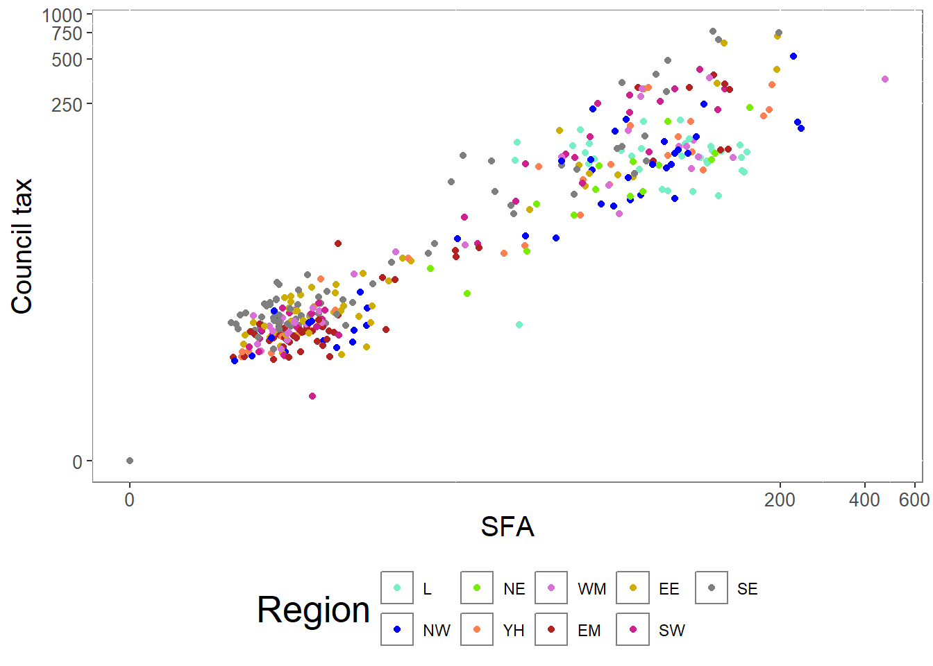
Creating a custom theme is useful to ensure all visualisations are formatted consistently.
4.1.7 Facet functions
Faceting allows us to divide a plot into subplots based on some grouping variable within the data. This allows us to show multiple variables in the same visualisation without risking overloading the plot and losing the intended message.
For example, if we wish to show the relationship between SFA, council tax total and regions over the entire time period, we may wish to create a scatterplot per year. Faceting allows us to do this in one piece of code rather than repeating it per year. Faceting will also ensure that plots are on the same scale and therefore easier to compare. The function facet_wrap creates these facetted plots:
# Take the long formatted dataset
csp_long2 %>%
  # Remove the Greater London Authority row
  filter(authority != "Greater London Authority") %>%
  ggplot( ) +
  # Plot the SFA against CT total and colour by region
  geom_point(aes(x = sfa, y = ct_total, colour = region)) +
  # Use the region colour palette
  scale_colour_manual(name = "Region", values = region_palette) +
  # Change the axis titles
  labs(x = "Settlement funding assessment (£ millions)",
       y = "Council tax total (£ millions)", colour = "Region") +
  # Separate data into a plot per region
  facet_wrap(~ year) +
  # Use the intro course theme
  theme_intro_course()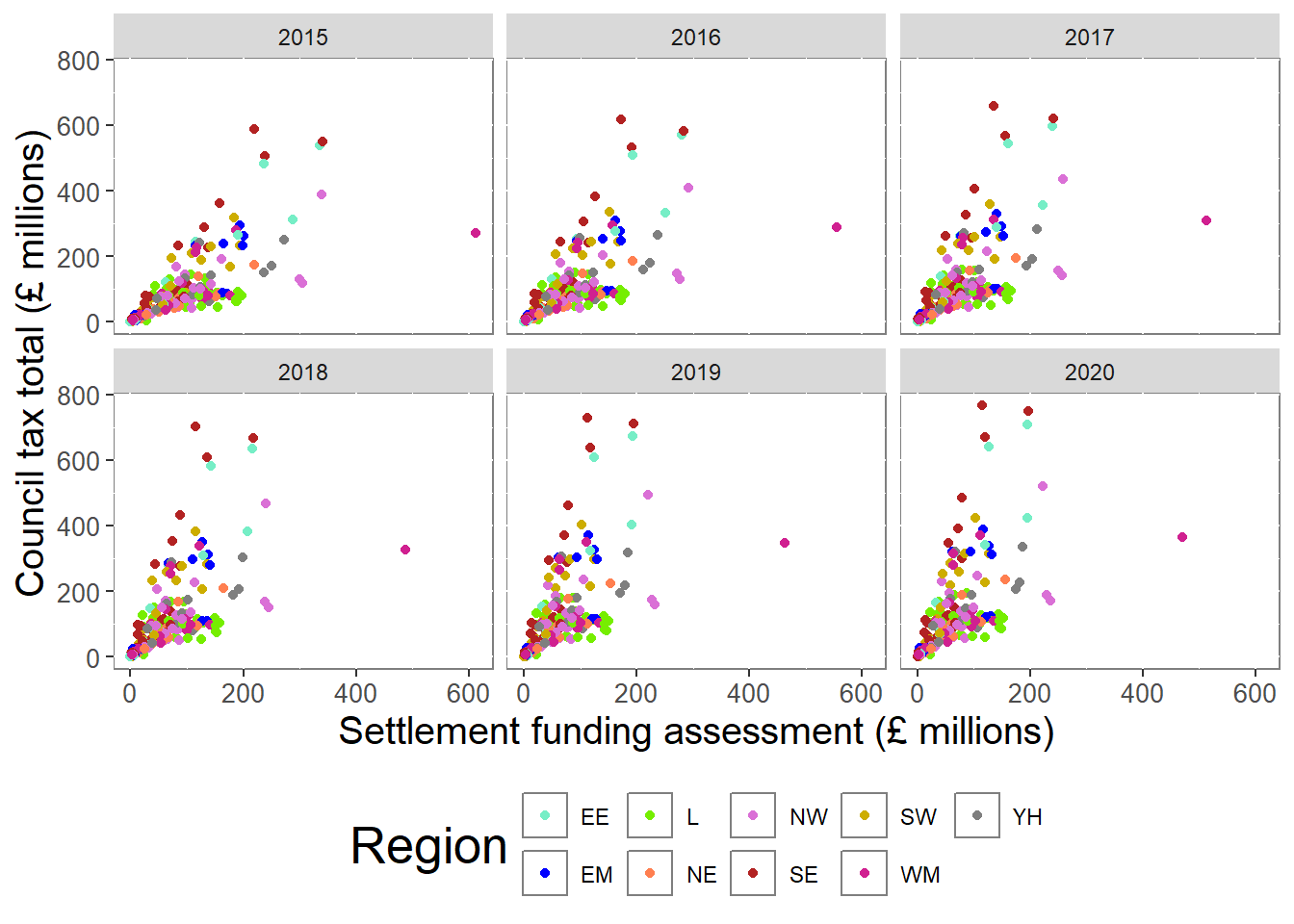
Exercise 7
Use an appropriate data visualisation to show how the total spend in each local authority has changed over the years between 2015 and 2020. Choose a visualisation that shows these trends over time and allows us to compare them between regions.